Difference between browser zoom ratio and screen scale: Site-specific adjustment
This article was translated from its source language with AI assistance. Please check technical terms and equations against the original.
Key Summary: If only the text on a single site is small, zoom in on the browser; if multiple apps and icons are all small, check the Windows scaling. Resolution, scaling, and text size serve different purposes, so it is easier to check the results if you do not change them all at once.

Order at a Glance
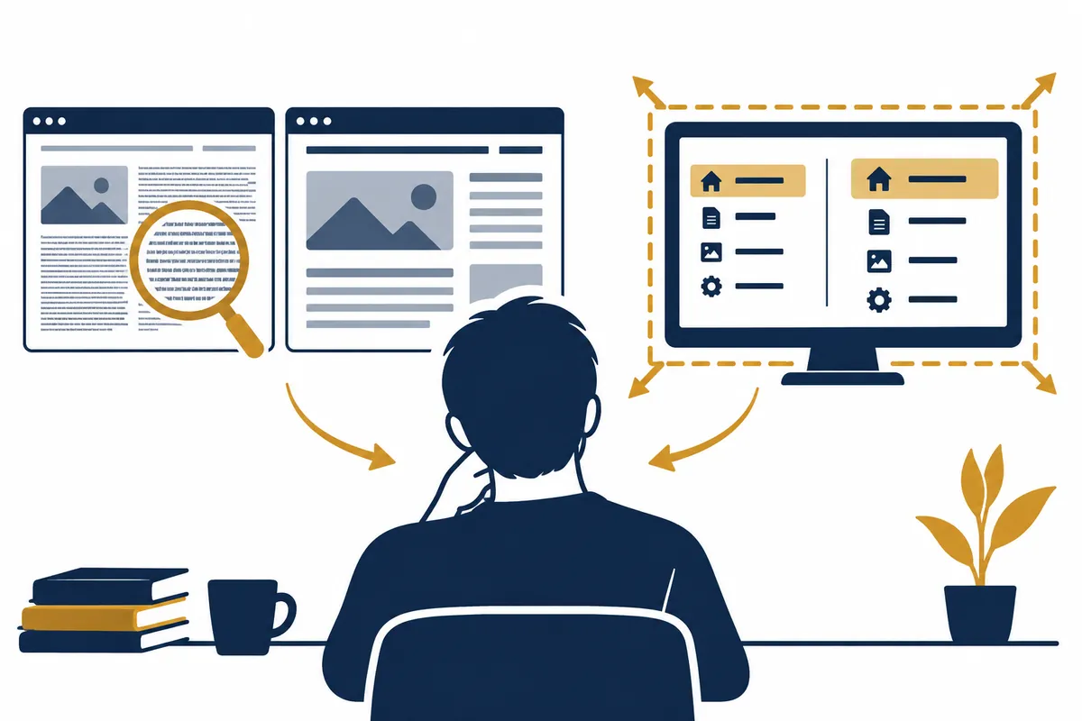
This is an illustrative diagram. It is not a screen capture or an actual test result.
1.Check inconvenient range
2.Read site zoom value
3.Windows Text·Scale Separation
4.Change one by one and compare the same screen
5.Per-monitor values and rollback criteria records
First, write down in one sentence what is small.
There is a difference between a situation where only the webpage content is small and a situation where the browser menu and taskbar are also small. If you experience inconvenience on a single webpage, you can first try zooming in on the site; if you experience inconvenience across multiple apps, you can review the operating system's display settings. If you describe the problem solely in terms of screen size, it is easy to change different settings simultaneously.
Assuming a hypothetical reader finds it difficult to read only the text on Site A, compare the magnification value on Site A with that of other sites. Conversely, if all app menus appear small, examine the text size and scaling ranges in Windows. This article is not a record of actual PC settings changes, and each example is an assumption illustrating the selection criteria.
| settings | The range mainly changed | Points to check |
| Browser site zoom | Page elements of the current site | Check separately from other site values |
| Browser default zoom | Default display ratio of a webpage | whether individual site settings remain |
| Windows text size | Text display on supported screens | Image · App Full Scale and Distinction |
| Windows screen scaling | Screen elements such as text and apps | Target monitor and current recommended values |
| Screen Resolution | Display pixel configuration | Distinguishing between font size adjustment and purpose |
| Full screen mode | Window display method | This is not a function like page zooming. |
| View PDF Zoom | Page view in document viewer | Separate from webpage or OS scale |
Check the current site zoom level in Chrome
Google provides guidance on zooming in the Chrome More menu and the Ctrl and + or − shortcuts. To view the current page larger, read the values in that menu and adjust them in small increments. You can distinguish between individual pages and common displays by checking if the same issue occurs after switching sites.
On certain websites, line breaks or menu positions may change depending on the zoom level. Since this may be the result of the page being positioned within a display area of different widths, please check for both increased text size and screen cropping. Instead of changing the value to a very large amount all at once, compare whether buttons and the main content are visible within a comfortable reading range.
You can organize saved zoom values from sites like .
Google guidance explains the path to managing site-specific values in Settings > Privacy & security, Site settings, More content settings, and Zoom levels. You can first find the value for a site that is currently causing you trouble and reset it if necessary. Check the target address before changing all site values at once.
If site-a.example is virtually at 175% and other pages are at 100%, you can examine whether that difference is connected to the current problem. Note down the address and settings, and after making the changes, view the same part of the same page. It will not be marked as complete until you verify on the actual screen whether these values have been applied identically to other profiles or other PCs.
Divide Windows text size and scale
Microsoft distinguishes between methods for adjusting text size in Windows and scaling that enlarges entire elements, including images and apps. If you only need to adjust the text, look at the text size range; if you want to enlarge multiple elements together, review the display scaling. Similar names do not imply the same scope of application.
Since some apps or screens may display differently, changing the value does not guarantee that the size will be the same across all programs. After applying the changes, check the menus and input fields in the apps you actually use. You must examine whether it has become easier to read and whether necessary buttons remain on the screen to evaluate the purpose of the setting.
A situation where two magnified values appear to overlap
If browser page zoom and operating system scaling are applied simultaneously, both can affect the final visible size. For illustrative purposes, multiplying 125% by 120% results in 150%, but this does not guarantee that all UI elements will actually grow to exactly the same size as this number. You must distinguish between app layout, fonts, pixel processing, etc.
When explaining overlapping effects, list the two values separately. If you record only one setting as 150%, it is difficult to know which value to revert to later. Observe the visible sizes of different apps and webpage line breaks separately, and if you have not checked the actual screen, indicate that the product of the numbers is a simple arithmetic example.
설명용 표시 상태 기록
Monitor label: display-a-example
Windows scale before: 125%
Text-size setting before: record actual value
Browser default zoom before: 100%
Site A zoom before: 120%
Site B zoom before: 100%

산술 예시
1.25 × 1.20 = 1.50
이 값은 두 비율의 곱을 설명하는 계산입니다.
모든 앱의 실제 렌더링 크기·배치·글꼴이 정확히 150%라는 시험 결과가 아닙니다.

Change one setting at a time.
Compare the same content in the same window.
Record the old value before restoring.
Do not confuse lowering the resolution with scaling.
Resolution relates to the composition of pixels displayed on the screen, while scaling is a setting that adjusts screen elements to their visible size. Please distinguish between the two settings before lowering the resolution solely to enlarge the text. Microsoft's guidance covers the appropriate resolution and display size for your device separately. You must check the actual recommended values on your current monitor's settings screen.
Specific values are not used as the recommended resolution or scaling for all monitors. Monitor size, viewing distance, window layout, and app types may vary. If you record the original values and check whether the necessary screen is visible after changing a setting, you can secure a standard to revert to in case of failure.
| Virtual inconvenience | Small verification step | Result Evaluation |
| Site A, only the font is small | Reads the current zoom value of A | Readability and line breaks of the same text |
| All app menus are small | Windows Text/Scale Range Separation | Check menus and input fields in multiple apps |
| The size is different on the two monitors | Record current values per target monitor | Compare the same window on each screen |
| The screen is too big so the button is not visible | Compare recently changed value with original value | whether the necessary button is in the display area |
| Only the webpage is cropped horizontally | Check site zoom and responsive layout | Do not confuse full-screen transitions with zoom recovery |
| Only PDF is displayed in a large size | Check document viewer zoom level | General webpage enlargement and separation |
| The image looks blurry | Distinguish between resolution, app view, and image source | Enlarging the small original does not increase information |
| The result of changing the settings is ambiguous | Stop other changes and compare the same screen | Check the cause one by one |
Multiple monitors record which screen was changed.
In a multi-monitor environment, identify the target display and record the settings for each screen. Corresponding screen numbers to actual locations helps reduce the mistake of accidentally changing values on another screen while attempting to switch the right screen. If the display size changes when moving a window, also note which monitor the observation was made on.
Compare the same window and content, but if there are instructions to reopen the app, follow the instructions on the actual settings screen. This article does not guarantee that the application time will be the same for all apps. If the physical size or resolution of the two monitors is different, it cannot be assumed that the same percentage setting will feel exactly the same size.
Reads site-specific values and default values together
If you have changed the browser's overall default zoom but a specific site continues to show different values, you can check the saved values for that site as well. Distinguish between the purpose of setting default values and the purpose of managing exceptions for individual sites. If important business sites already have easy-to-read settings, there is no need to unnecessarily reset all values while troubleshooting the cause.
For explanatory notes, record the site address, previous value, changed value, and actual observation in a single row. General font size settings and full page zoom may also be different options. Google advises that some sites may not support browser font size changes, so read Coverage first when results differ.
Include a comparison of the same screen in the troubleshooting log.
If you change the operating system scale, resolution, and browser zoom all at once, it is difficult to determine which changes have had an impact. Select a scene that is difficult to read, record its previous state, and then change only one setting. If the result differs from the objective, you can record the process by returning to the original value and checking the next candidate.
When sharing screen captures, explain only the target area to avoid displaying unnecessary information such as account or document content. There is no need to send login details or your entire browsing history to explain resizing issues. If there is no actual screen comparison, do not assume it was successful and leave it with only the settings changed.
The ultimate goal is to be able to read and manipulate the necessary content.
In addition to the increased text size, check if buttons, tables, and input fields are clearly visible and if unnecessary horizontal scrolling has occurred. Adjust the zoom value for a specific site to suit the page's intended use, and verify operating system settings across multiple apps. We cannot guarantee that the appropriate value will be the same for every device.
The ratio multiplications and work logs in this article are for illustrative purposes only. They are not reports on actual screen quality or readability tests, nor are they a calculator that automatically finds optimal values. Official sources from Google and Microsoft serve as the basis for verifying the range of each setting, while the problem classifications and change logs were created personally.
Official Source and Verification Scope
Official data verification date: 2026-10-08. Items re-verified by publication date: Site zoom management path, Windows text size and scale range, actual recommended values for the current monitor and app application guide.
AI Authoring Assistance. The examples, figures, and work records in this text are self-created illustrative examples. They are not presented as experiences performed in actual user environments or measurement results.
Original illustrations created to help explain this article.
Original on Tistory ↗